? ??????????????Music Falls off the Page? ????? ?? ???Rating: 4.2 (32 Ratings)??6984 Grabs Today. 33392 To
tal Grabs. ??????Preview?? | ??Get the Code?? ?? ?????BoomBox? ????? ?? ???Rating: 4.5 (23 Ratings)??5347 Grabs Today. 24399 Total Grabs. ??????Preview?? | ??Get the Code?? ?? ?????? BLOGGER TEMPLATES AND TWITTER BACKGROUNDS ?

Final Music Video

Digipak

Digipak

Magazine Advert

Magazine Advert

Saturday 26 February 2011

Conventions of a promotion advert

1. To make the audience aware so that they have heard about the album release

2.To capture the interest so the audience are more likely to buy the album

3.Encourages the audience to buy the album

The purpose of an advert is to inform us about the product and then show us the benefits of the product and then persuade us to buy what we are seeing on the advert. In order to persuade the audience further, the advert needs to stand out in order to catch the readers eye. The ways in which adverts do this is by using bold colours and fonts in order to make it stand out so the audience are more likely to read it. Especially when targeting a particular audience, such as people who like Pop music, adverts usually make the artist's image bigger than the writing depending on how well known they might be.


This example shows Lady GaGa on the front cover of Billboard magazine and she is the main focus of the front cover. She stands out from all the writing and headlines. This represents her quirky style as she has purple hair so her fans are more likely to recognise her. Her name is not that big either so this shows that she is quite well known to be able to be recognised without her name being big on the cover.

This is another example: Chris Brown is on the cover, but this is slightly different as his face is not shown just a long shot of him from the side. The subtitle is a rhetorical question and his name is smaller than this. This may indicate that he too is well known so the advertisers did not think he needed his name big in order to be recognised. His clothes match the colour scheme of the magazine in order to stand out. As his genre is Pop the colour purple is used because it is both a masculine and a feminine colour as he is a male Pop artist.

Album Promotion-Magazines

These magazines above are promoting the artists by having an image of them and then a title saying number one artist. This will make the readers want to but the magazine and then it may persuade them to buy the album by the artist.


This magazine has a pink background which represents the Pop genre and Katy Perry is dressed with flowers on her to show her quirky style. Her name is in bold which will persuade her fans to buy the magazine. On the website for Billboard magazine it gives a bit of information about the magazine which is below:

Katy Perry has landed the cover of the latest issue of Billboard Magazine to promote her upcoming sophomore album Teenage Dream.

The extensive accompanying article goes into a lot of detail about Katy’s plans, chatting to the singer herself, her record label and her various managers, who all make one thing very clear: The goal with Teenage Dream is to turn Katy Perry from a singles artist to an album artist.

http://www.theprophetblog.net/katy-perry-covers-billboard-magazine-as-teenage-dream-storms-the-charts

Wednesday 23 February 2011

Final Digipak

This is my final digipak design:


Wednesday 16 February 2011

Teenage Dream Research

I have noticed that on The Orange British Academy Film Awards, Katy Perry's Teenage Dream was played as Jessica Alba walked onto the stage to present an award. It was also used in an episode of the television programme Sun Sex and Suspicious Parents shown on BBC three. This suggests that the song is very popular to be played on shows like this. It also featured in this weeks episode of Glee which is an American television programme. The cast did a cover version of the song, which again indicates the popularity of the song. The fact that it is played in American shows as well as British, also indicates that it is widely known.


Take Me Out

After watching this weeks episode of Take Me Out, I noticed that there was a man at the end that also dressed as a woman. The fact that all the women turned their lights off when they saw this transformation shows that maybe society still does not accept this especially in terms of dating. This is what our narrative is about for our music video, but with ours the boy keeps this identity secret from his girlfriend which again represents the fact that he is hiding from society and is afraid of showing his true identity.

Thursday 10 February 2011

Digipak


This is my front and back cover to my digipak.

Album Cover Draft

I think I am going to use this one because the colour pink fades out to purple and her eyes look brighter so it makes her stand out more. The writing is also clearer.
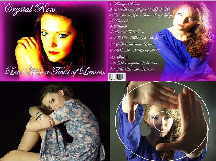
I think the pink is too bold in this photo, although it is quite similar to the one above I still prefer the one above.

I do like this cover as well, but it makes Michaela's face blue so I am not sure about it. However the writing does stand out more.

Feedback on Album Cover

After some audience feedback, most of them said that they liked it, but it could have some changes made to make it clearer:

Some people said that they was not sure about the border. However I think I might keep the border because it represents the Pop genre as it is pink and girly. Whereas if I left it plain and without a border, I do not think it would stand out. I might however, make the writing stand out a bit more because it is a little bit unclear.

Album Cover Draft

This is my first draft of my album cover I am going to do some research to see whether or not I am going to keep it. I have asked for some audience feedback, one person said from looking at it straight away they thought it looked like Adele's album cover. So this is conforming to the Pop genre but I am still unsure of whether to keep it yet. I am unsure of the font and colour as to whether it is visible or not:

Wednesday 9 February 2011

Comparison

The image I was going to base my album cover on is this one below:

I liked the pink make up and how the blue of her eye stands out. This is similar to a photo that we took yesterday:
I like the one that shows her make up and that she is looking away I think this looks really effective. I think I want to have pink make up though instead of blue so I might have to take some more photos.
I also like this one with her looking straight at the camera so I am not sure which one I am going to use yet. I still need to edit the photos though just to make her eyes really stand out and sparkle like a crystal to represent the artist name.

Katy Perry Merchandise

Katy Perry has recently launched her new perfume called 'Purr'. This shows that she is a popular artist as there are a lot of fans there to see her launch the perfume.

Tuesday 8 February 2011

Digipak Photos

When we were filming today, we also took photos which we are going to use for our digipaks. We still need to take some more as I want a few of Michaela in different outfits and make up. We now need to photo shop the photos to add effects for our digipak designs. I have made a collage of some of the photos we took today:
Collage
I like the images of Michaela looking down as it shows the make up and it looks really bold and bright which represents the genre. I wanted photos of her eyes particularly for my album cover. I got a few but I think I am going to take some more because they were a bit out of focus and I want some with pink or purple eyeshadow instead of blue.

Filming

Today we filmed the performance parts of our video. We used the projector to put pictures in the background. At first we did not know if this would work because we thought the light would hide Michaela's face. However some of the images looked really effective. We used colours like pinks and purples to represent the Pop genre. We also used the photography room for a plain black background so that we have different locations and still shots. We used the cloth in the picture below which is the same background we used for our opening shots because we think this will be a good transition.
I think the make up is really good it turned out how we wanted it to look. We used the blue to match the dress and we used the diamonds which is good as it will represent the band name- Crystal Rox. We now want to change the outfit and use different coloured eyeshadow for the next shots so we have Michaela in different outfits to make it more interesting for the audience. The colours we want are pinks and purples again to represent the Pop genre.

Monday 7 February 2011

Digipak Presentation

Digpaks

Thursday 3 February 2011

Meeting- 02/02/11

Today we had a meeting to finalise our shots and to make sure we had what we wanted. We are also going to film around my house to make sure we have everything because we have to refilm some shots that we were not happy with.

Tuesday 1 February 2011

Digipak Ideas

Katy Perry's digipak contains images of her inside so I think this is what I am going to do for my digipak but instead use different images of Michaela as she is our artist. This will be conveying to Pop genre as most Pop genre digipaks use images of the artist. She is also wearing a unique outfit so if I am going to use this idea I might have to find something that stands out for Michaela to wear so that it is not too boring. However I might not use this idea, but instead go with the theme of crystals which is in the artist's name and use different images. For example, I could use an image of a heart (to go with the theme of the song) and it could have crystals on it or even pouring out of it like a broken heart. However I am not sure how I will show this.

I particularly like this image with someone fixing the pieces of the heart together. I think this is good because it reflects some of the lyrics in the song as it looks like a puzzle and in the song there is a lyric of 'my missing puzzle piece'. So I think this could be quite an effective image to use.

Possible Album Cover Idea

I quite like the idea of having Michaela on the front cover with as a close up of her face and to incorporate the artist's name 'Crystal Rox' I was going to make her eyes almost crystallized. I was hoping I could use photo shop for this but I'm unsure of whether this will work or not. I also

do not want this to look scary like the image below of the girl, it could look odd which is an effect I do not want.

All of the pictures above are the effect I want to try to achieve but I am still unsure of how I am going to do this and will have to try it.


I quite like this picture because of the colour which could represent Pop and the swirly patterns could represent 'Crystal Rox' as some parts look like crystals. This is what I would like to try with Michaela's eyes but I don't know if it will be possible to do yet.


Album Name

I used the song name generator to try and think of an album name to put on my digipak cover. I used the common word 'love' in the title because I think this represents the music genre as well as the storyline. Below are the list of names it came up with:

Love Is Everywhere

New Wave Love

Love Campaign

The Beauty Of Love

Love Will Hang Us All Out To Dry

Love Isn't A Crime... Yet

Foreign Love

Love Vixens

Love With A Twist Of Lemon

Missiles Of Love


I think some of these names will represent the storyline of the music video quite well because our video contains a twist ending so 'Love with a Twist of Lemon' could represent the twist in our storyline, however I still need to decide which one I am going to use.