Our opening to the video is going to be lots of different photos of a couple from a wedding album. The photos are in black and white with a pink background and they are going to be placed down onto the background with the first seventeen beats of the song:
Thursday 27 January 2011
Opening Shots
Posted by Emily Bowe at Thursday, January 27, 2011 0 comments
Labels: Music Video Opening
Friday 21 January 2011
Change of Narrative
We have decided to change our narrative due to the male actor that we needed for it, not turning up. So because of this we have made some adjustments to our narrative which is now about a transvestite getting ready to meet his girlfriend. We are going to keep this a surprise until the end, so to achieve this we need to show extreme close ups of the male putting on make up and getting dressed. We might do shots of the back of him too. He is going to be in a relationship with a girl even though he still dresses up as a girl. We thought this would be good to reflect the fact that people should not judge relationships.
For the performance part of the video we are going to have Michaela lip syncing in a dress with a white background. Then to contrast this we might have her dressed in jeans and a baggy jumper with a black background. This is because we want to hint our narrative to the audience so by having her dressed more girly for one bit and then dressed down and looking more like a boy in the next bit, this will hint to the audience what is going on, even if the audience does not get it. We also want to include the boy's transformation to a girl by showing him walking towards the camera and gradually changing. This will be done with editing which is similar to the Tia Maria advert below:
Posted by Emily Bowe at Friday, January 21, 2011 0 comments
Labels: Narrative
Thursday 13 January 2011
Generic Conventions
I found this presentation on the website below which gives a definition of generic conventions of album covers:
http://www.slideshare.net/rswan04/generic-conventions-of-an-album-cover
Katy Perry's album cover for Teenage Dream is what you would call a typical Pop genre cover as it has bright, bold colours. Like the presentation above says; it also has a picture of the artist (Katy Perry) which indicates the fact that she is probably well known so her audience would want to pick it up straight away. She has blue/purple hair which again makes her and her music genre stand out.

In the background there are different colours merged together but these are not too bold in order to make Katy Perry stand out from the background. She is looking up at the album name which looks as if it is a sign of a bar or club as it is lit up. Her name is then underneath near her photo and it is in bubble writing, which has a glossy and shiny effect. Like the presentation above has indicated, there are similar colours used throughout. The artist's name is similar to the colour of her lips, again like the presentation above has indicated, which could suggest that most pop artist's use this effect in order to make a connection with their genre.
I think the audience of this album cover would be mainly a female audience as the colours used such as: pinks, purples, blues are all girly colours. The album name, 'Teenage Dream' could also suggest that the audience would specifically be aimed at teenagers. Her audience would probably like this cover as it is girly and the artist stands out so they can easily identify it.
Posted by Emily Bowe at Thursday, January 13, 2011 0 comments
Labels: CD Cover Research, CD Digipak
Saturday 8 January 2011
Digipak Research
As shown above the digipak had a booklet included and a side that opened into a poster of the band.


4 panel 1 CD Digipak. Tray on right. 5.53" X 0.25" X 5": This is the size of the template above. I am still unsure of how many sides I want our digipak to be.
Posted by Emily Bowe at Saturday, January 08, 2011 0 comments
Labels: CD Digipak
Friday 7 January 2011
Digipak Research
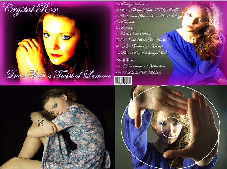
A digipack is a CD or DVD case composed of a polystyrene or polyethylene CD tray glued inside a cardboard cover. They are considered environmentally friendly compared to plastic jewel or even slim jewel cases. Any cardboard based CD-ROM/DVD case is referred to as a digipack. I think our digipak should be bold and colourful like the one above as it reflects our music genre. The one above has the name of the artist, plus a small photo of the artist in black and white which is a contrast to the bold colours in the background in order to make the artist stand out. The artist's name is a bigger font than the album name so it doesn't really stand out. I think this is a good idea as I like the name that we have for our band so I think it will look good in bold, big font.
Posted by Emily Bowe at Friday, January 07, 2011 0 comments
Labels: CD Digipak

